Macros + Miles
A run+nutrition log built for athletes — miles, macros, and recovery on a single screen.
- Astro 6
- Tailwind CSS 4
- TypeScript
- Inline SVG data viz
- Vercel
Case study
- Fitness & training
- Health tracking
- Data viz
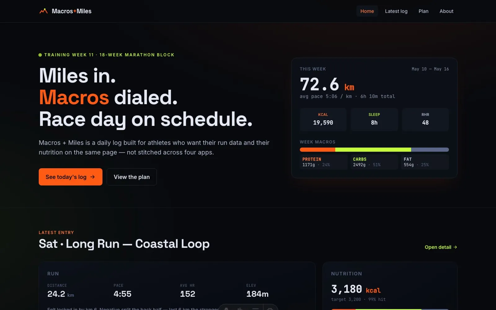
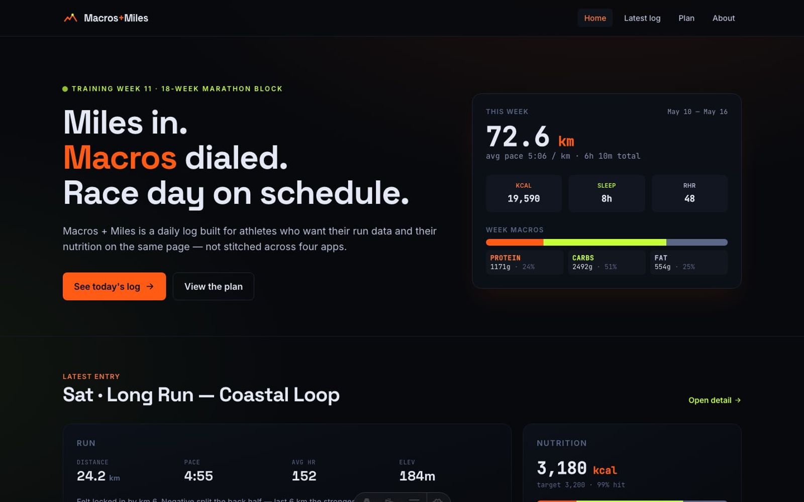
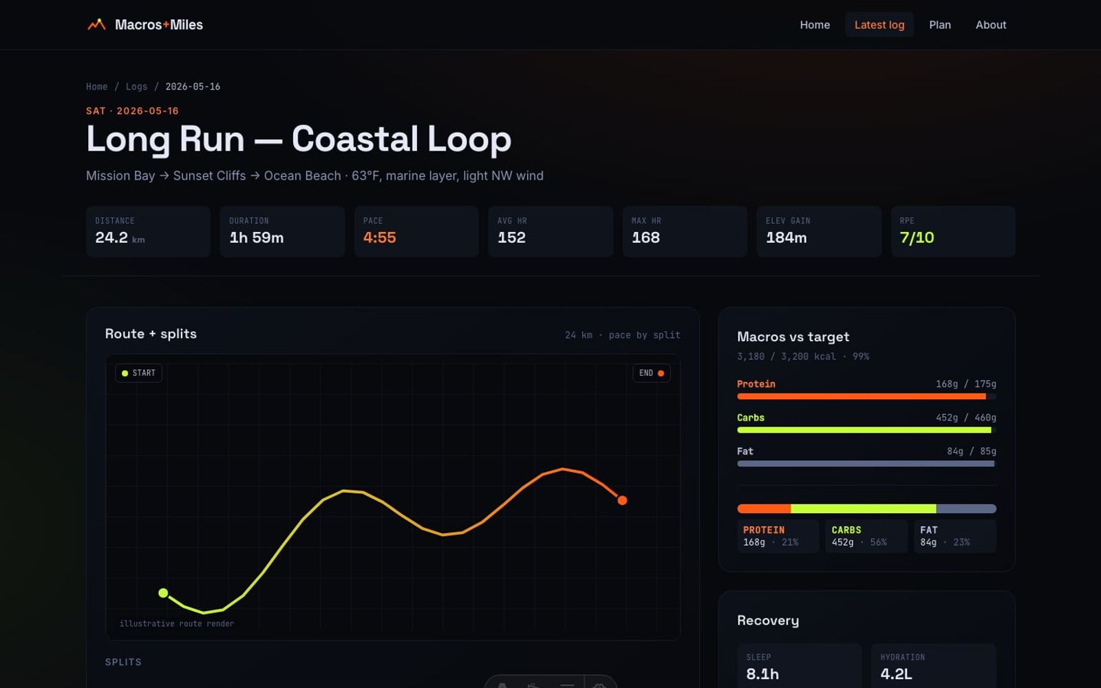
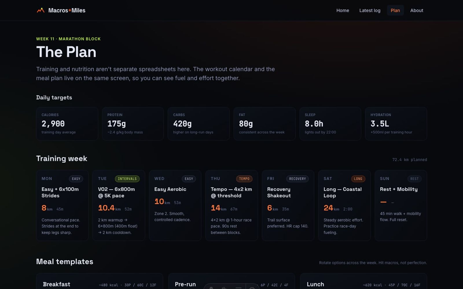
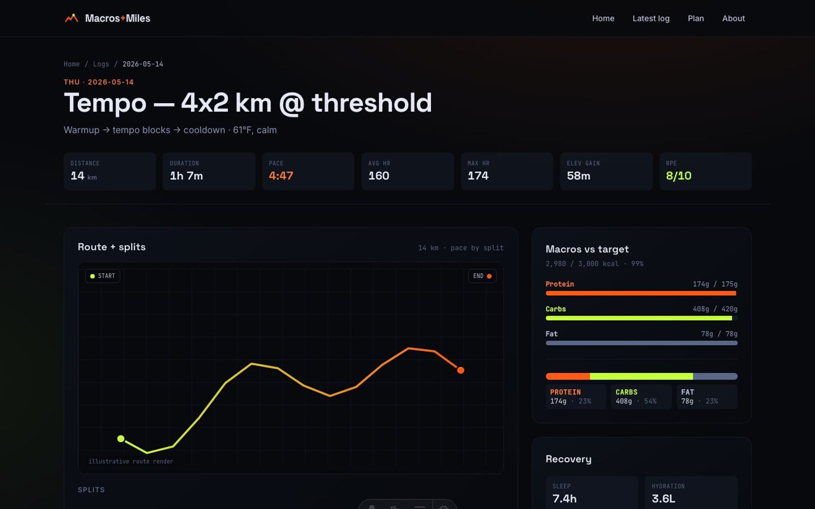
Macros + Miles is a daily training log built around a single conviction: fueling and effort belong on the same screen. Every log entry combines a run (distance, splits, pace, heart rate, elevation, perceived effort) with full macro tracking (calories, protein, carbs, fat, per-meal breakdown) and recovery metrics (sleep, hydration, body mass, resting heart rate). The week view shows distance, calories, macros, and average sleep at a glance, with a workout plan and rotating meal templates living on the same calendar.
The build is a static Astro site with Tailwind CSS 4 and inline SVG data viz — no heavy chart libraries. Pace bars, route renders, weekly distance charts, and macro splits are all hand-rolled SVG and CSS, which keeps the page weight low and the visual language consistent. The visual identity leans athletic and kinetic: bold sans-serif display type, flame-orange and electric-volt accents on a deep ink background, big numbers, no chrome.
Accessibility is treated as a feature, not an afterthought. Every page meets WCAG 2.2 AA: keyboard navigable, visible focus rings, AA color contrast, charts carry text equivalents, and motion respects prefers-reduced-motion. There is no scroll-triggered pop-in — content is available immediately. An accessibility statement and direct contact email are linked from every page.
The site ships with 8 mock daily logs that exercise every shape of training day — long runs, threshold tempo, VO2 intervals, easy aerobic, recovery shakeouts, and a full rest day. The data layer is realistic-shaped, so the same UI would slot directly onto a real athlete's data without any visual changes.
Screenshots
Home — data viz hero, weekly stats at a glance
Like what you see?
Let's build something together.
Have a project in mind? I'd love to hear about it.